Strategic
Asset Management
Emailed 02/02/09
Only once in a blue moon
 Hello all: Hello all:
While the stock market receives most of
the attention in the daily news, recent bond market events are actually more
noteworthy in the severity of their dislocation. I'll avoid getting
technical with you, but two sections of the bond market aptly demonstrate how exceptional 2008 really was. Municipal bond / Treasury ratio: Municipal bonds are issued by states, cities, counties, etc and their income is generally tax free to the owner of those bonds (There are technicalities, but we won't cover them here and they don't alter the data presented) Since the interest is tax free and municipalities hold the power to tax, yields are usually lower than US treasuries of the same maturity. While there is the possibility of default on a municipal bond it is generally low. As you can see from the graph below,
2008 was a bit different than usual. The graph is the ratio of high
quality municipal bonds to US Treasury yields of the same approximate
maturity. A number of 90% would mean municipal bonds provide a yield
of 90% to Treasuries.
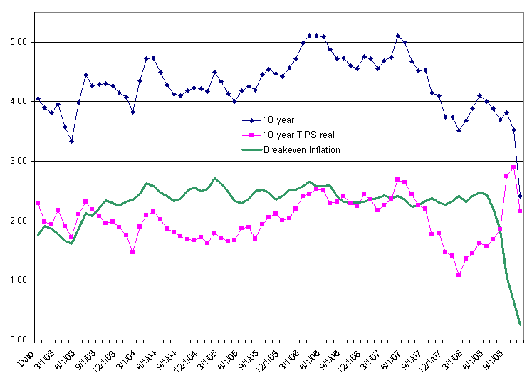
Before 2008 municipal yields almost never traded with a higher yield than treasuries, and with good reason. For a little credit risk you were well rewarded when the muni / treasury ratio went above 100%. As of December 2008 the ratio was well above 170%! Like many other ideas pushed too far, hedge funds were created to extract excess returns from this relationship. Add too much leverage and a severe market stress and you see what happens. As prices dropped on municipal bonds to extreme levels, more hedge funds were forced to sell, creating a vicious downward cycle The case can be made municipal bonds deserve to trade at a higher yield right now due to the risk of default by the underlying city / county / state but nearly double the usual yield is a bit extreme. TIPS (Treasury Inflation Protected Securities): TIPS (Treasury inflation protected securities) are a bit more esoteric but also show the recent market dislocations. The chart below has 3 lines: 10 year, 10 year TIPS real, and Breakeven Inflation. 10 year is the yield on the 10 year Treasury note. 10 year TIPS real is the real yield provided on a 10 year TIPS bond from the US Treasury. The TIPS provide a yield of (inflation + a fixed percentage, the 'real yield)'. Subtracting one from the other gives you the Breakeven Inflation, or the markets expectation of the inflation over the next 10 years. As you can see from the green line, Breakeven Inflation wandered above and below 2% until 2008. While this graph does not show it due to using monthly average data, at one point Breakeven Inflation was zero, and on shorter term TIPS it was actually negative! Short term deflation is possible but over the long term is very unlikely considering monetary policy and US Government long term liabilities.
Other sections of the bond market are also at extremes but I think the two graphs above neatly describe how radically disjointed up the markets are right now. They are slowly healing themselves right now but it will take some time, and provide opportunity. Similar graphs can be produced for the stock market but the multiple factors inherent in stock prices reduce their clarity in showing how out of wack the markets are right now. The good news: These extreme outliers are good for us long term. Until 2008 most financial models did not include financial shocks as severe as the one we are in right now. The models did not account for enough risk For a very long time banks, corporations and investors will ask 'How would a 2008 event affect our portfolio?' Supposedly 'safer' investments should hopefully be more secure and riskier assets may be underpriced for some time. Underpriced risky assets are a benefit. Properly identify those risky assets with improving fundamentals and you will be richly rewarded.
--Greg |
|
|
|
|
(253) 927-0998 |
Strategic Asset Management |
|
Strategic Asset Management is a fee only financial advisor intent upon providing its clients with independent and unbiased advice. PAST RESULTS ARE NOT INDICATIVE OF FUTURE RESULTS. THERE IS RISK OF LOSS AS WELL AS THE OPPORTUNITY FOR GAIN WHEN INVESTING. Note: This communication is not an offering for any investment. Greg Merrill is President of Strategic Asset Management which is an investment advisory firm registered in the Washington State.
|
|
| Strategic Asset
Management voice: 253-927-0998 email: solutions@sasm.com Strategic Asset Management is an investment advisory firm registered in Washington State. |
For Email Marketing you can trust
|
|||||||||||||


